sejistudio
- 18 Jul 2024
- 4 min read
9 Packaging Trends to Beat the Shelf Snooze
Ever walk down a crowded aisle and feel like every product is yelling for your attention? Yeah, us too. That’s where packaging comes in – it’s your product’s silent salesperson on the shelf. So, how do you design packaging that cuts through the noise and gets noticed? Check out these 9 hot trends that are shaking things up:
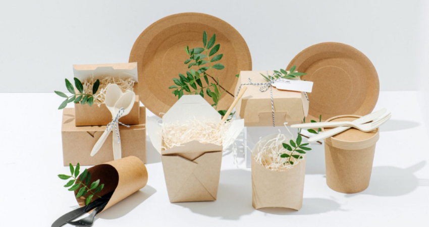
1. Sustainable Packaging: Eco-Friendly and On-Trend

image source: Speed commerce
People are way more into saving the planet these days, meaning they want products with packaging that reflects that. Think recycled cardboard, minimal plastic, and materials that won’t hang around in landfills forever. It’s good for the earth and good for your brand image – win-win!
2. Groovy Retro Vibes: Back to the 70s!

Image source: Campaign
Remember those funky colours and wild patterns from the 70s? They’re back in a big way! Picture mustard yellow, burnt orange, and groovy fonts. This trend is perfect for grabbing attention with a playful, nostalgic vibe, especially for younger folks or products with a vintage feel.
3. Hand-Drawn Awesomeness: The Human Touch

image source: 99designs
In a world of digital perfection, there’s something refreshing about a little imperfection. Hand-drawn illustrations and lettering add a human touch to your packaging, making your brand feel more down-to-earth and approachable. This is great for products that promote natural ingredients, craftsmanship, or a brand that’s all about keeping it real.
4. Feeling the Texture: Packaging You Can Touch
")
image source: Filestage
Forget flat and boring! Textured packaging adds another layer to your design, inviting people to pick it up and feel it. Think of embossed patterns, cool lettering that pops out, or even using natural materials like wood or fabric. This creates a stronger connection with the product and leaves a lasting impression.
5. Transparent Packaging: What You See is What You Get

image source:Pinterest
Honesty is the best policy, even in packaging design! Using clear windows or fully transparent packaging lets people see the actual product they’re buying. This is perfect for showing off the beauty of natural ingredients, the freshness of food, or the intricate details of something handmade.
6. Minimalism: Less is More

image source: Pinterest
Clean lines, simple layouts, and focusing on the essentials – that’s the minimalist trend. This approach lets the product itself be the star, creating a feeling of sophistication and elegance. It’s perfect for high-end products or those that prioritize function over fancy frills.

Mascots can be a powerful way for people to remember your brand, especially kids. But this trend takes mascots beyond the usual cartoon character. Think playful illustrations, simple line art, or even 3D mascots that are part of the packaging itself.
8. Bold and Bright Colors: Making a Statement

image source: Packaging Of The World
Don’t be afraid to be loud! Bold and bright colours can make your product jump off the shelf, grabbing attention and creating a sense of excitement. This is ideal for playful brands, seasonal products, or those targeting a younger demographic.
9. Color Psychology: Choosing the Right Palette

image source: World Brand Design Society
While bright colours can be eye-catching, remember that colours can also make people feel specific ways. Understanding colour psychology can help you pick the perfect colour scheme to convey your brand message. For instance, reds and oranges create a sense of urgency, while blues and greens promote feelings of calm and trust.
So, there you have it! By incorporating these trends into your packaging design, you can create something that not only stands out but also resonates with your target audience and reflects your brand values. Remember, the best packaging design is a mix of function, good looks, and that all-important emotional connection.
Want packaging that pops? See our packaging portfolio for inspiration, or contact us for a free consultation!


